Typography Refresh
Salesloft required an in-app typography update to enhance user experience, improve readability, and avoid licensing fees. Choosing the right typeface was essential to preserving the brand's integrity while ensuring a cohesive user experience. The new typeface needed to align seamlessly with the company's product, values, and visual aesthetics.
Expertise and contributions:
Creative Direction
Design Systems
Type Design
Visual Design
Company
Salesloft
Role
Senior Visual Designer
The challenge
Facing a tight one-week deadline, Salesloft needed to quickly replace the in-app typography from Proxima with a new typeface. This transition came with several challenges, including ensuring the font remained legible across various sizes and screens, especially since sellers frequently work with minimized windows.
The change needed to be seamless, avoiding any disruption to the user experience. The new typeface had to not only enhance usability and readability but also evoke the right emotional response from users.
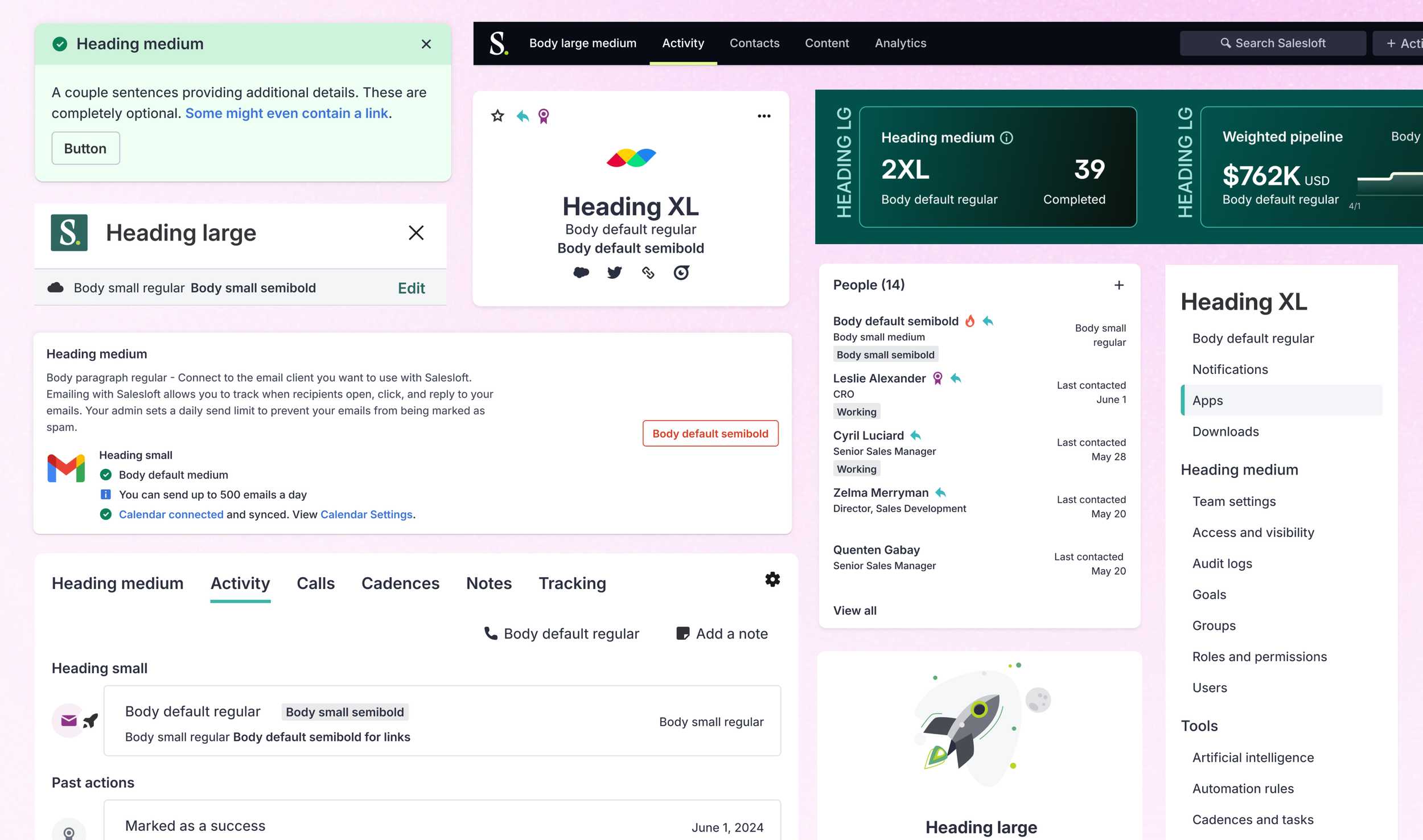
Early in-app explorations using Inter across several pages within Salesloft
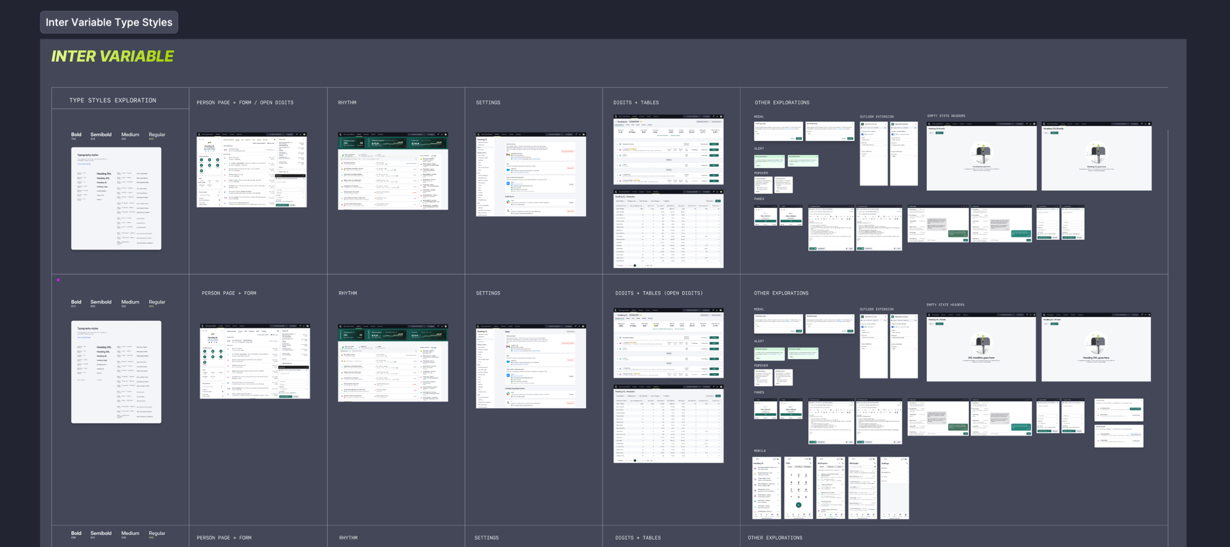
Salesloft’s new typography styles and and example of using Inter Variable
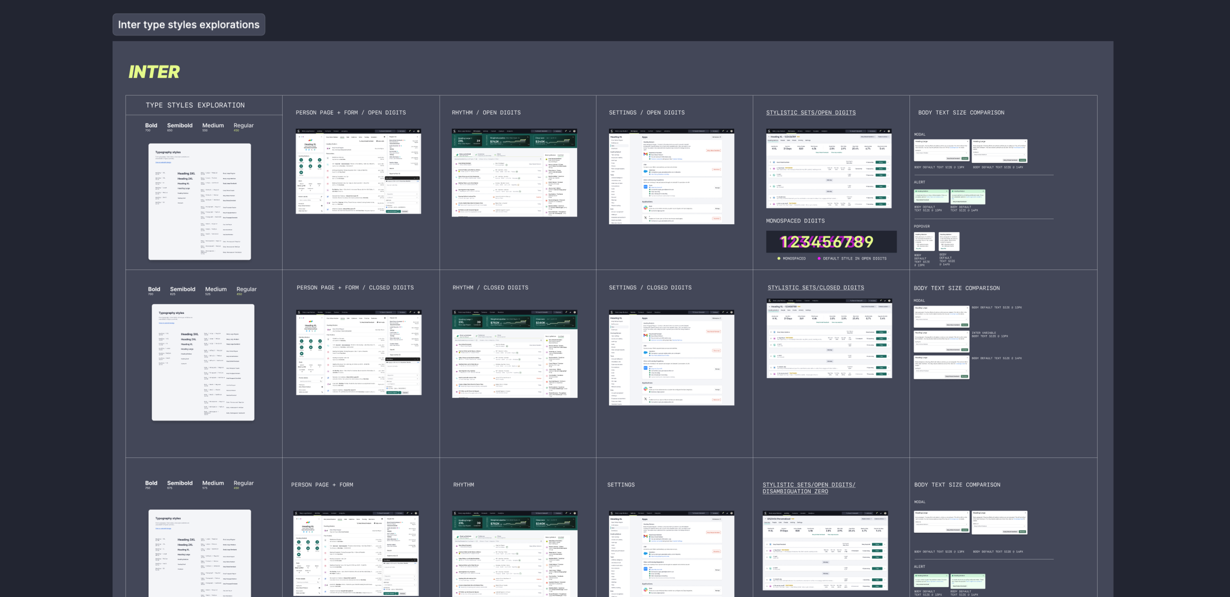
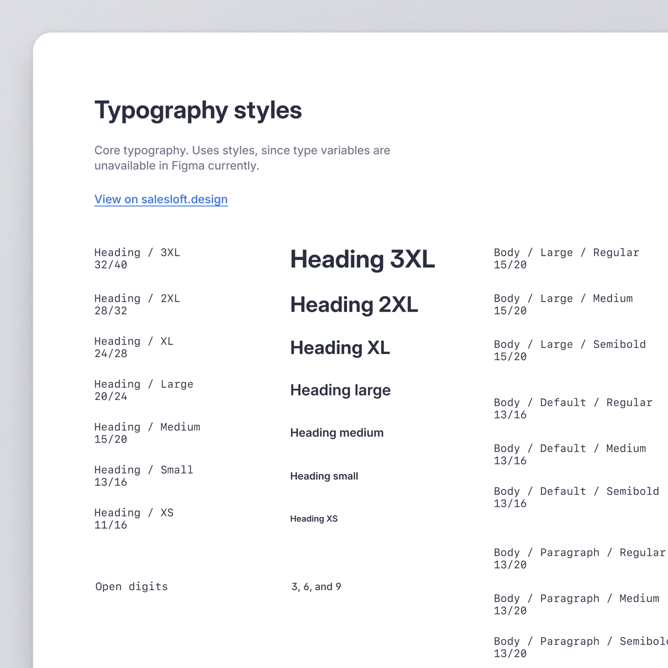
Through multiple iterations and explorations, the flexibility of Inter Variable allowed me to create new typeface weights, ranging from a 450 regular base to a 700 bold. I also introduced stylistic alternatives for digits, including a flat-top 3 and variations for 6 and 9, which significantly enhanced readability in charts, tables, and data-heavy content.
The process
I initiated the project by identifying typeface options that aligned with the existing design system, exploring IBM Plex, Roboto, and Inter. I developed mockups to present these options to the product experience design team, and after careful evaluation, we unanimously selected Inter as the optimal choice. As a free, open-source font family, Inter is meticulously designed and optimized for screen readability.
The solution
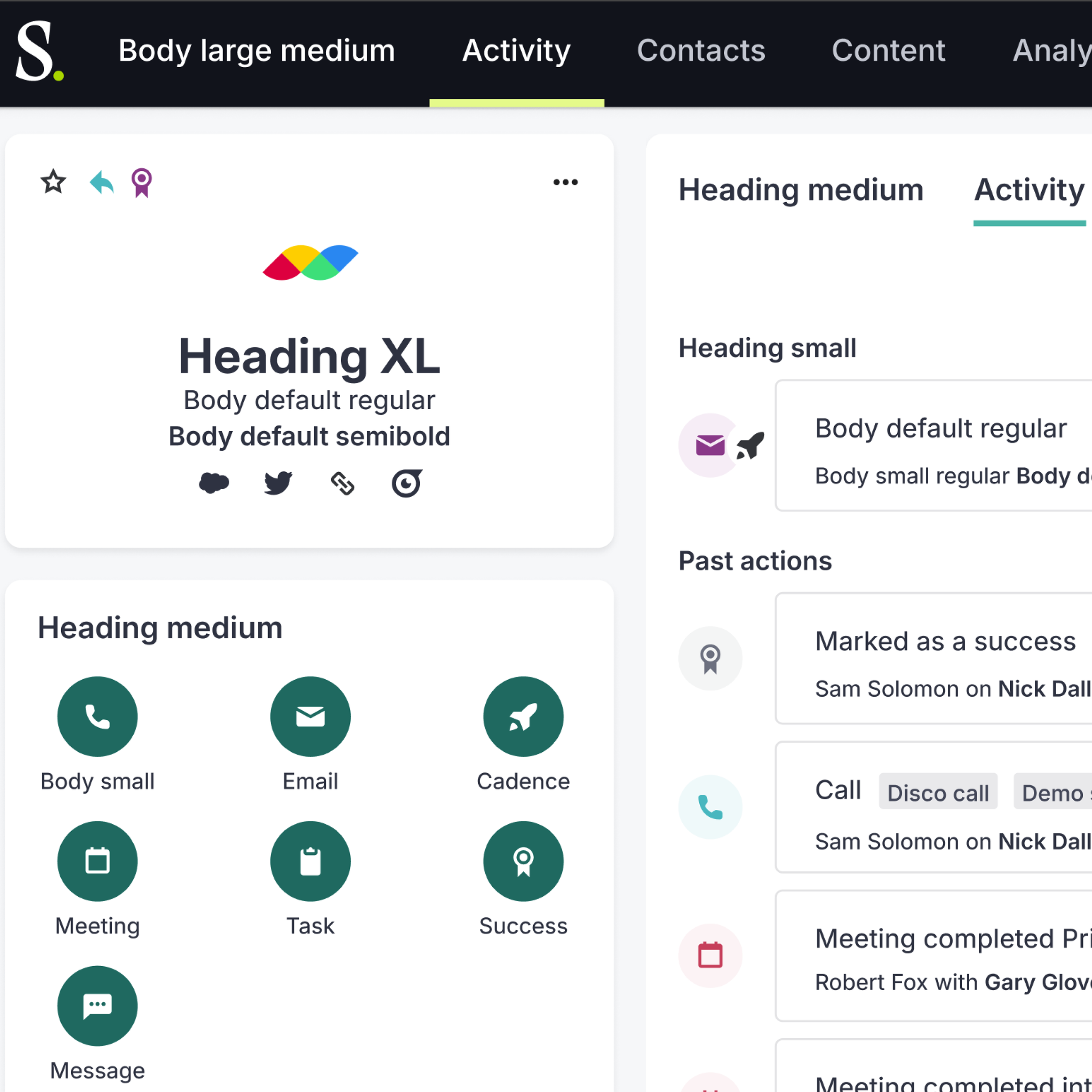
By exploring full-page mockups with Inter Variable, I enhanced the typographic hierarchy throughout the Salesloft app. I focused on content-heavy pages, proposing type styles that improved content flow and readability. These updates further strengthened Salesloft's Design System, ensuring consistency and improved user experience.
Figma file featuring pages ad components showing the before and after page hierarchy work