Visual Explorer Product Launch
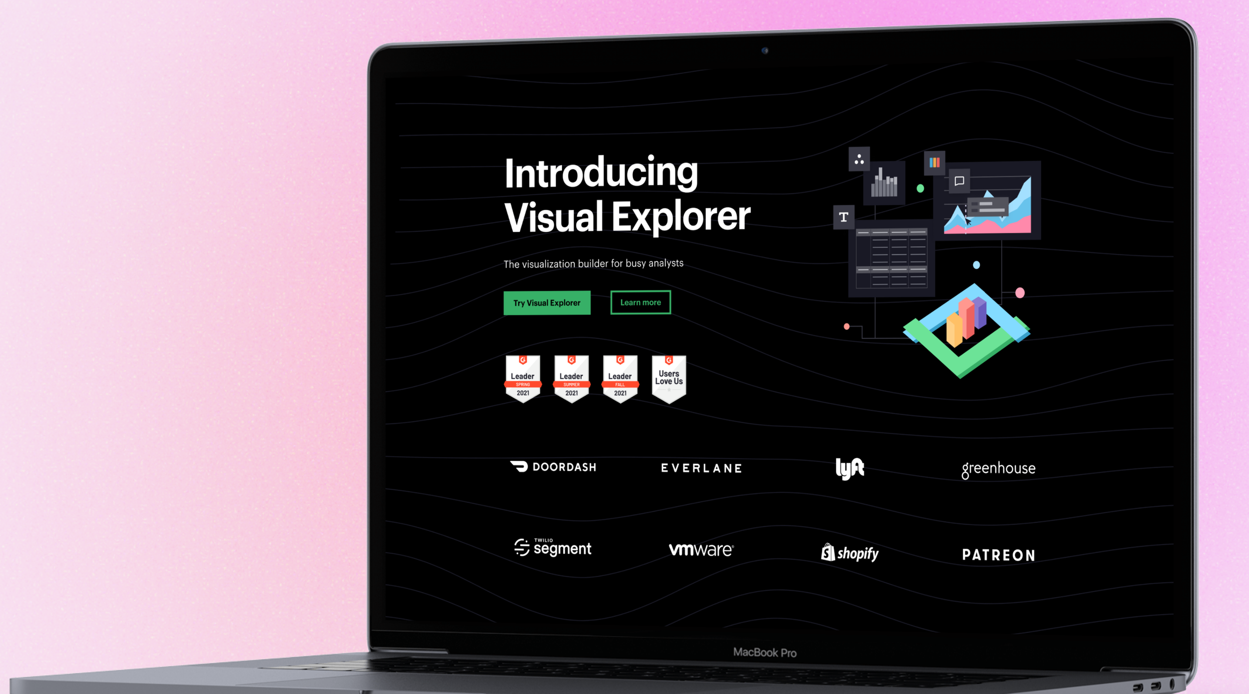
Mode’s Visual Explorer is an interactive platform that empowers users to create, interact with, and explore data visualizations in a dynamic, hands-on way. My role involved designing a flexible yet opinionated visual identity that not only elevated the product’s aesthetic appeal but also ensured consistency and clarity across various user interactions.
By combining thoughtful design principles with a user-centric approach, I helped position Visual Explorer as a standout tool within Mode’s product suite, enhancing its usability and overall brand presence.
Expertise and contributions:
Creative Direction
Visual Identity
Illustration
Web Design
Company
Mode
Role
Senior Brand Designer
The challenge
The primary objective was to launch Mode’s new Visual Explorer platform in a way that would generate excitement, build customer loyalty, and increase brand awareness. Mode needed a visual identity that not only captured the brand’s personality but also introduced a distinct, memorable look that would resonate with both existing customers and the broader data science community. This visual identity had to balance innovation and familiarity, ensuring it felt fresh and engaging while staying true to Mode's core values and appeal.
The process
Within a tight two-week timeframe, I took full ownership of creating the visual identity for Visual Explorer. I initiated and led meetings with the marketing, product marketing, and UX design teams to gain deeper insights into the new product. These discussions shaped the overall look and feel of the visuals, ensuring alignment with the product’s goals.
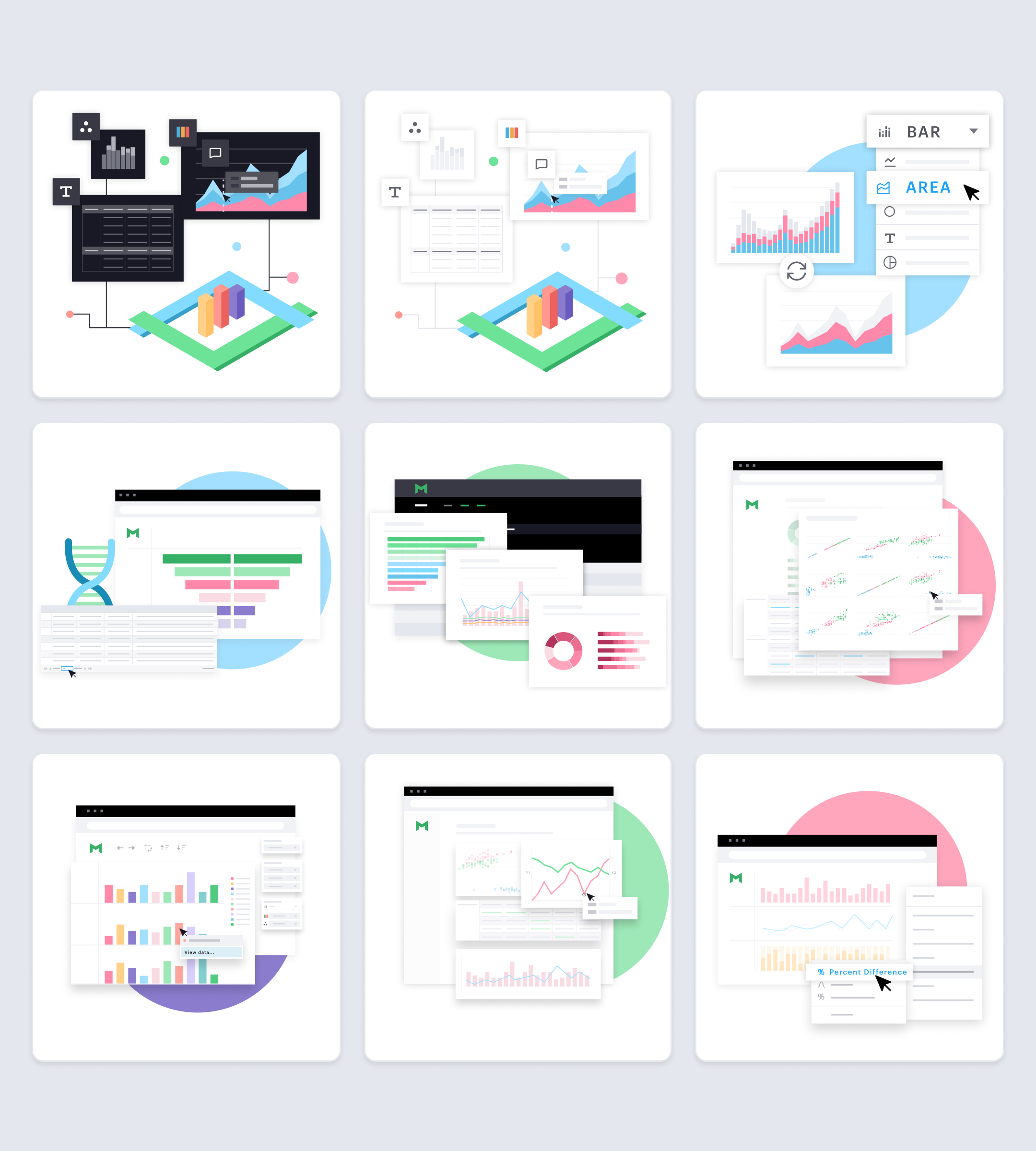
Additionally, I facilitated a workshop with the UX design team to brainstorm and develop in-app abstract illustrations that highlighted Visual Explorer’s innovative features. These visuals were designed to help both current and future customers grasp the full range of possibilities the product offers.
Refining the initial Visual Explorer icon and ensuring it adheres to a geometric grid
I inherited the initial Visual Explorer icon from the UX design team, and quickly identified the need for refinement. The angles and dimensions required adjustment to align with a precise geometric grid for greater consistency and balance.
Once the foundational graphics and assets were improved, I was able to move forward with creating the complete visual identity and accompanying marketing materials for Visual Explorer, ensuring a cohesive and polished presentation across all touchpoints.
Abstract illustrations created to quickly educate users on how to use Visual Explorer in app
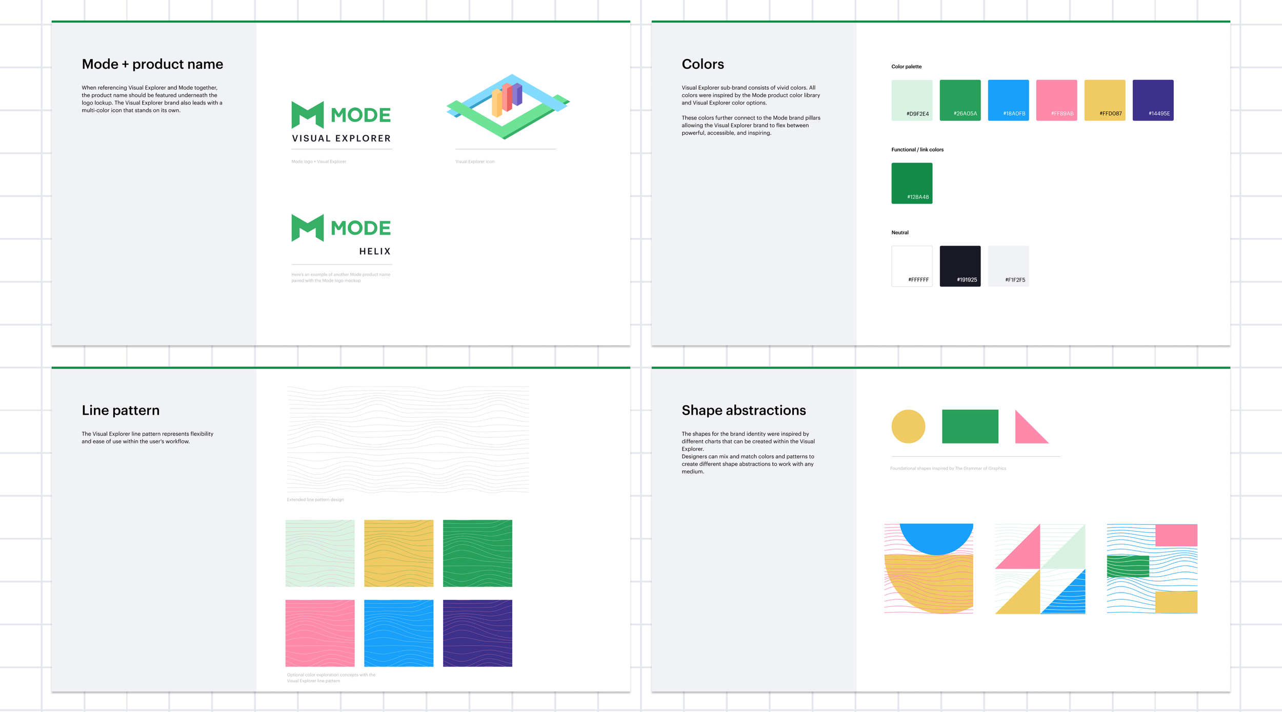
Additional brand guidelines that were shared with contractors and agency design partners
The solution
The visual design of Visual Explorer drew inspiration from the 'Grammar of Graphics,' incorporating foundational shapes and introducing fresh, vibrant colors, while staying true to the Mode product's aesthetic. It was essential that the visuals maintained consistency with the Mode brand but also felt new, colorful, and engaging.
Through the new visual identity, I introduced a thoughtfully scalable design language that enables the Mode team to apply a systemic approach when creating future content, visuals, and web pages, ensuring long-term consistency and flexibility.
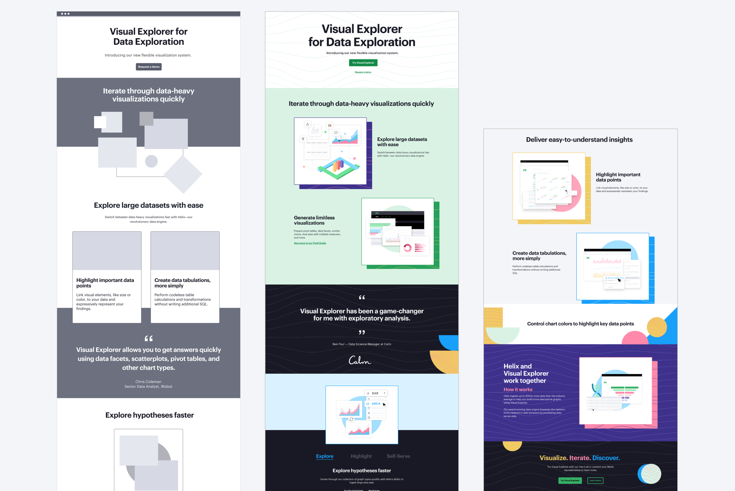
Product page wireframe and final page design
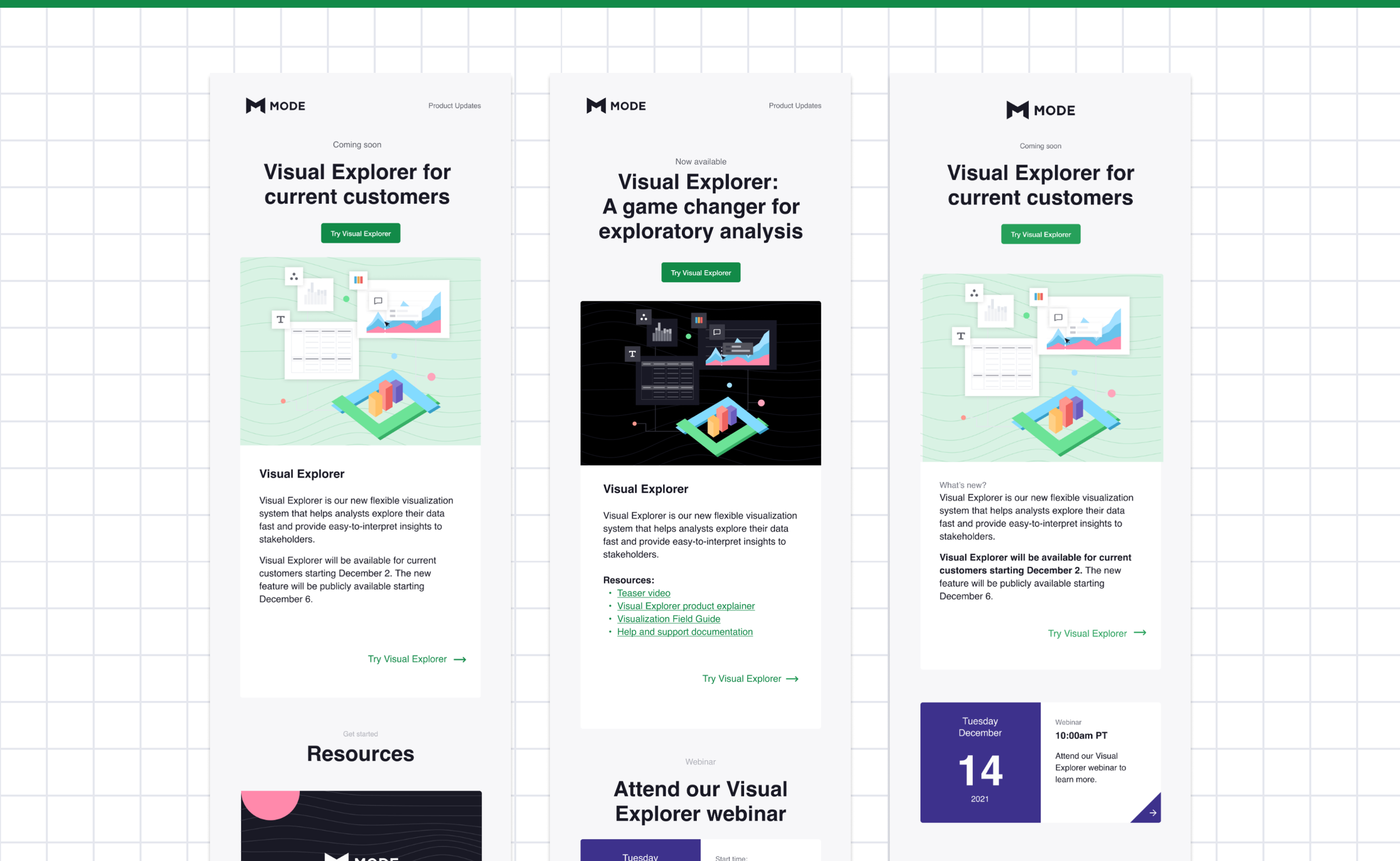
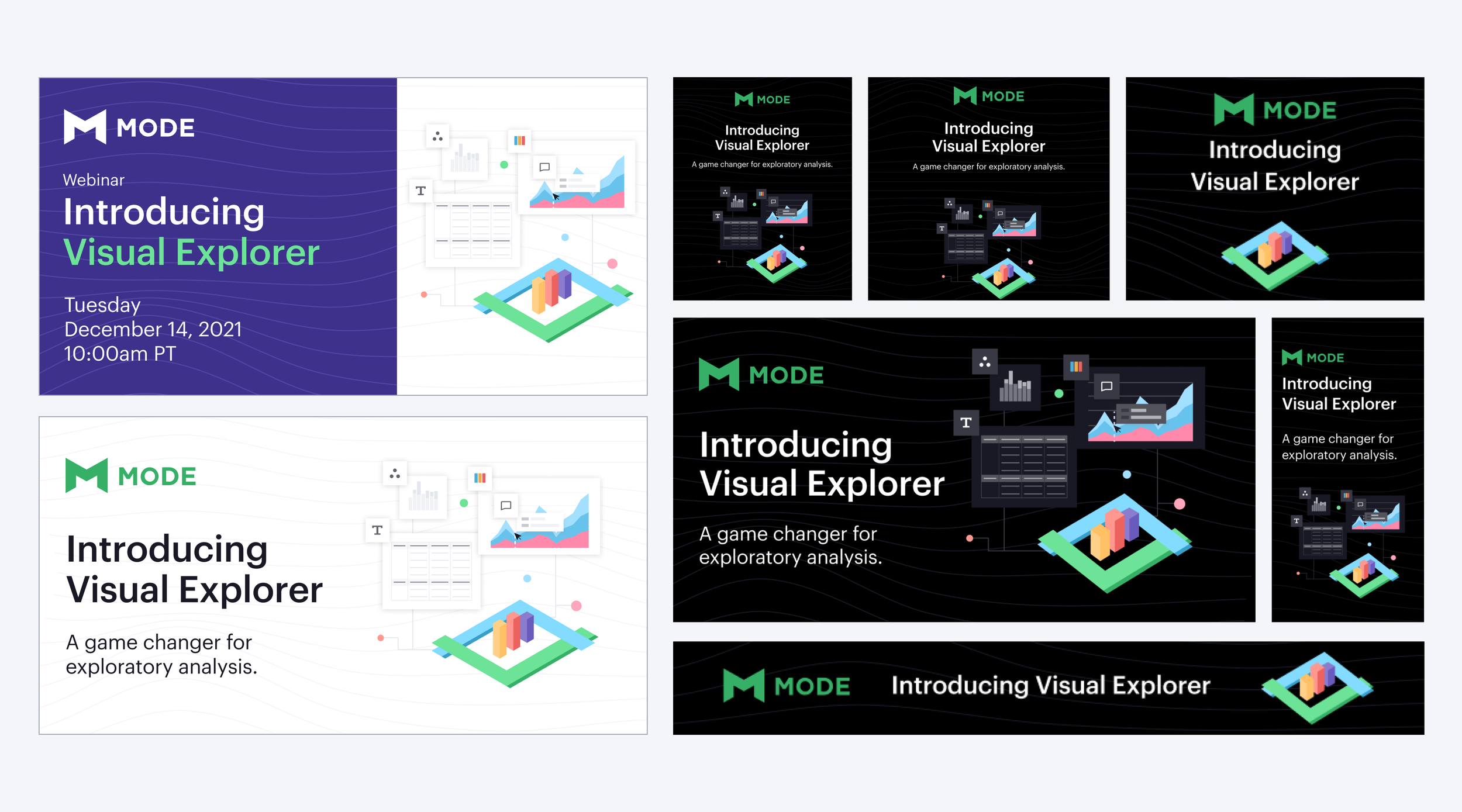
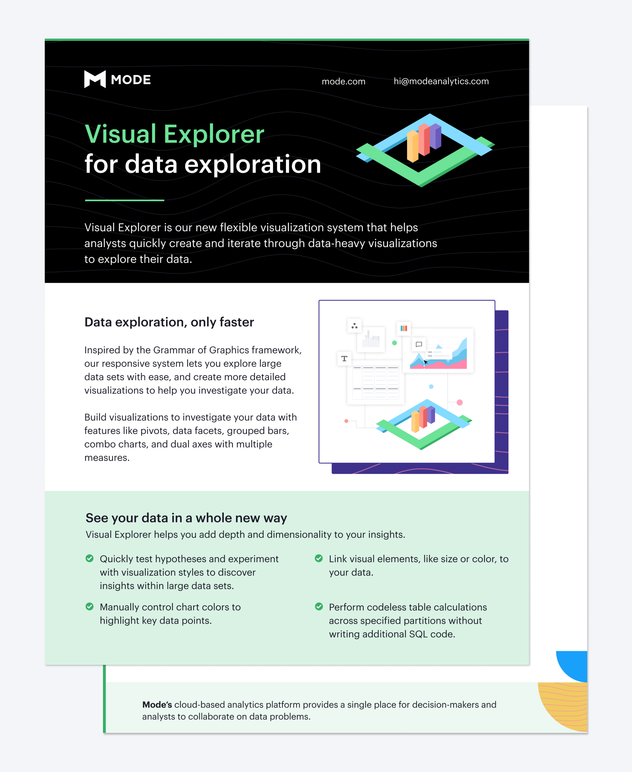
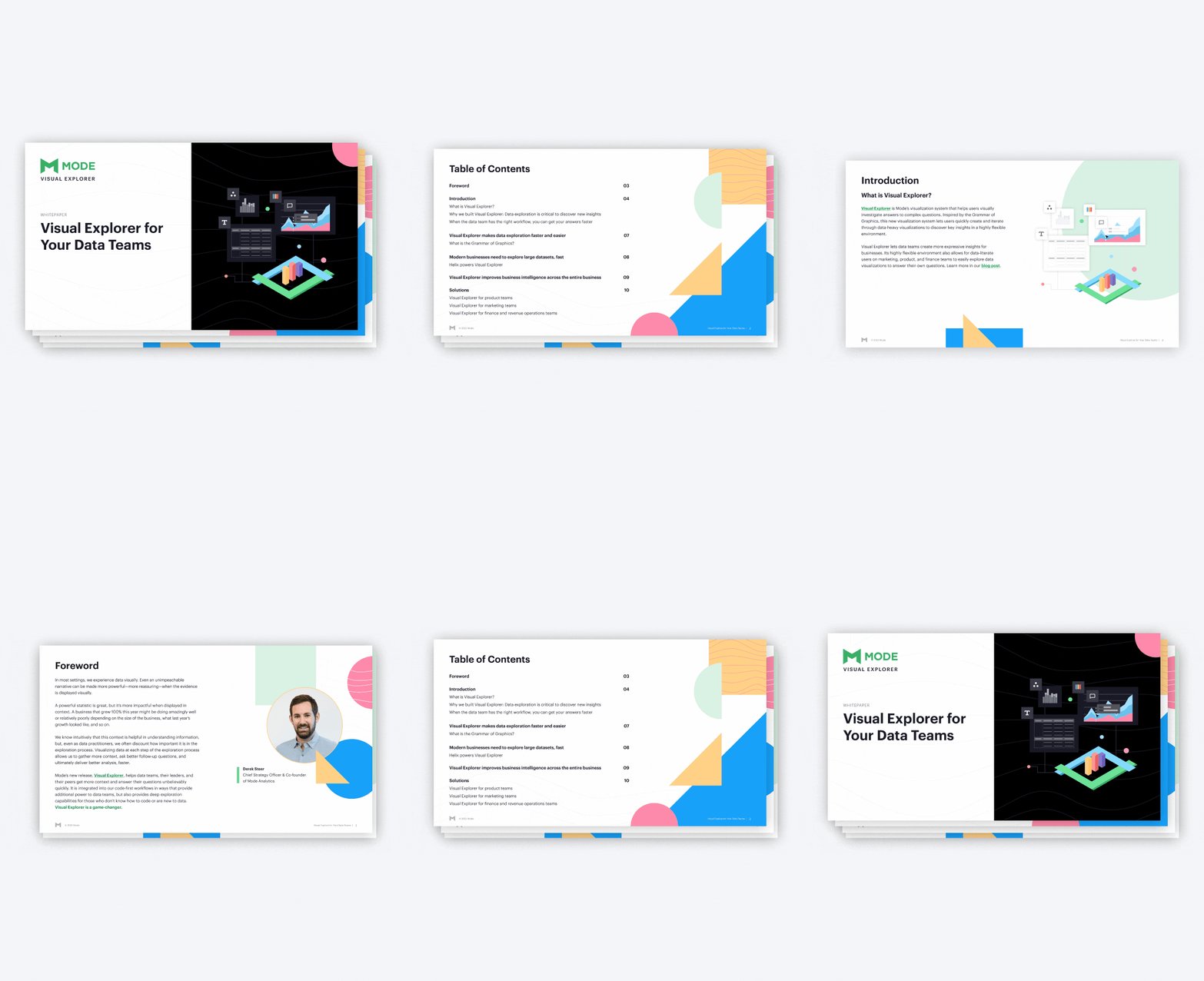
I developed a cohesive visual experience for Visual Explorer by creating a new product page, designing and coding email campaigns, marketing ads, and white papers. Ensuring consistency across all internal and external communication channels was crucial.
I utilized bright, dynamic visuals throughout all assets, seamlessly integrating the brand's visual identity with the product's UI/UX. This consistent look and feel across touchpoints helped reinforce a unified brand experience that resonated with both users and stakeholders.
Signature marketing emails that I designed, coded, and created a resourceful Marketo template for the marketing team to utilize
Various ads utilized across social media for the Visual Explorer campaign
Signature one paper assets used for product marketing and sales teams
Visual Explorer white paper created to educate new and current customers
