Rhythm Dashboard Design
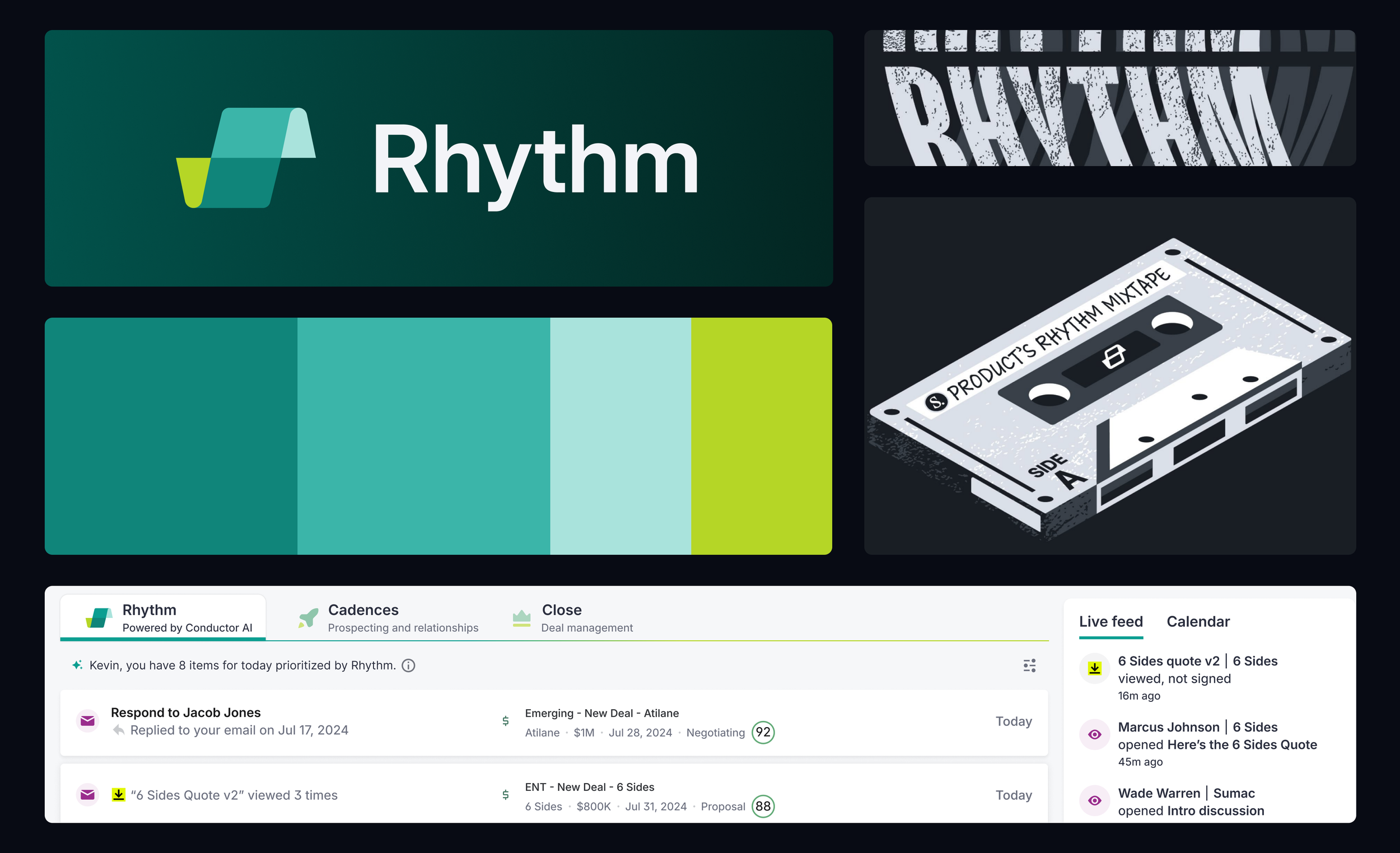
Salesloft Rhythm is a key feature within the Salesloft platform, designed to help sales teams manage workflows and prioritize tasks effectively. As the Senior Visual Designer, I developed the visual identity, refined the UI, and branded this new AI-powered product, ensuring it aligned seamlessly with the Salesloft brand.
Expertise and contributions:
UI Design
Visual Identity
Icon Design
Brand Design
Company
Salesloft
Role
Senior Visual Designer
The challenge
Rhythm needed a distinct visual identity to stand out from competitors. I refined the UI design and created a signature icon that became the focal point of the new Rhythm page. This icon now serves as a beacon throughout the application, guiding users through Rhythm-related tasks and features.
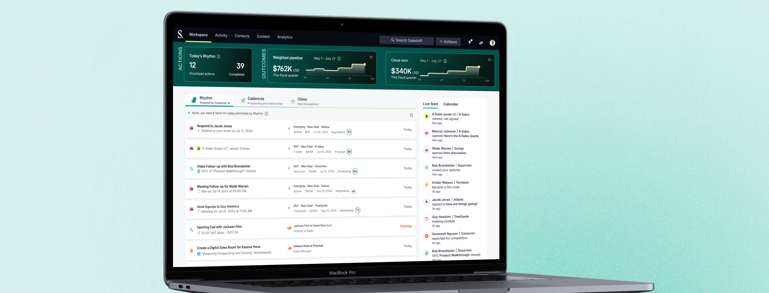
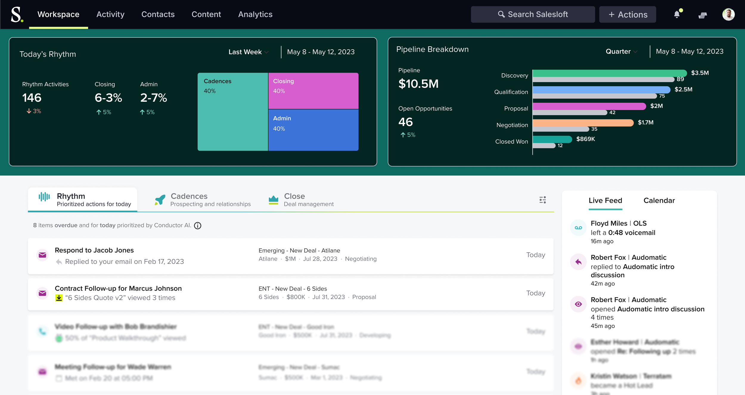
Salesloft’s Rhythm platform
The process
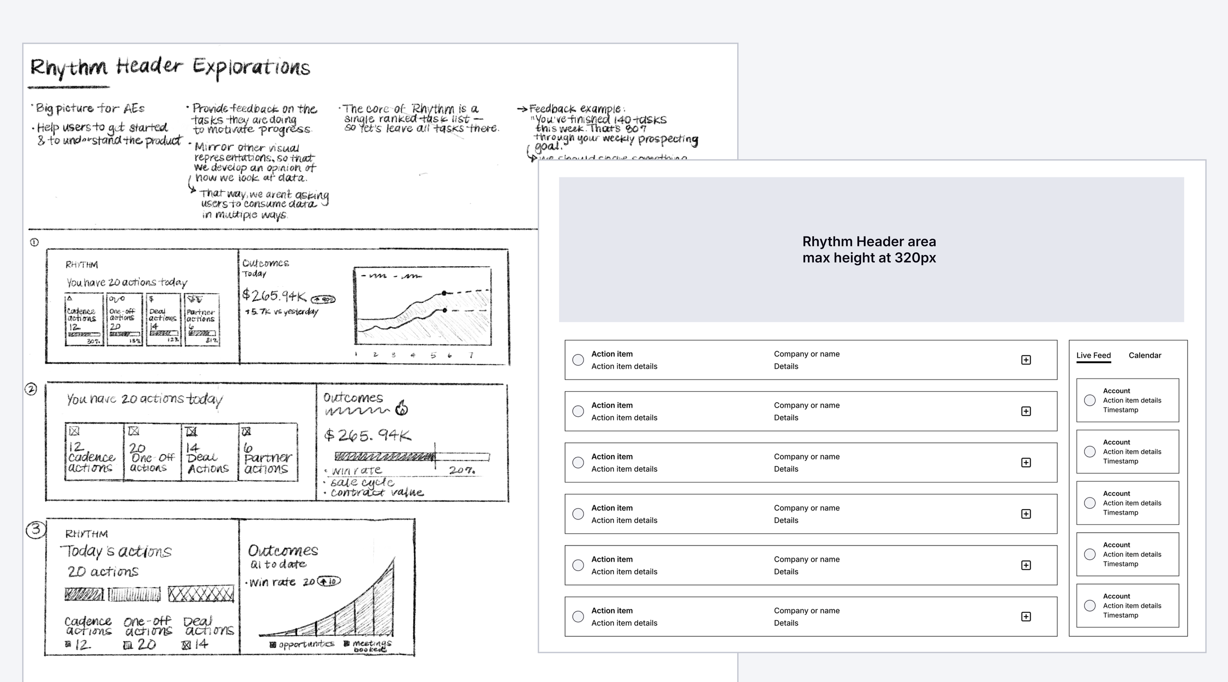
Early sketches and wireframes
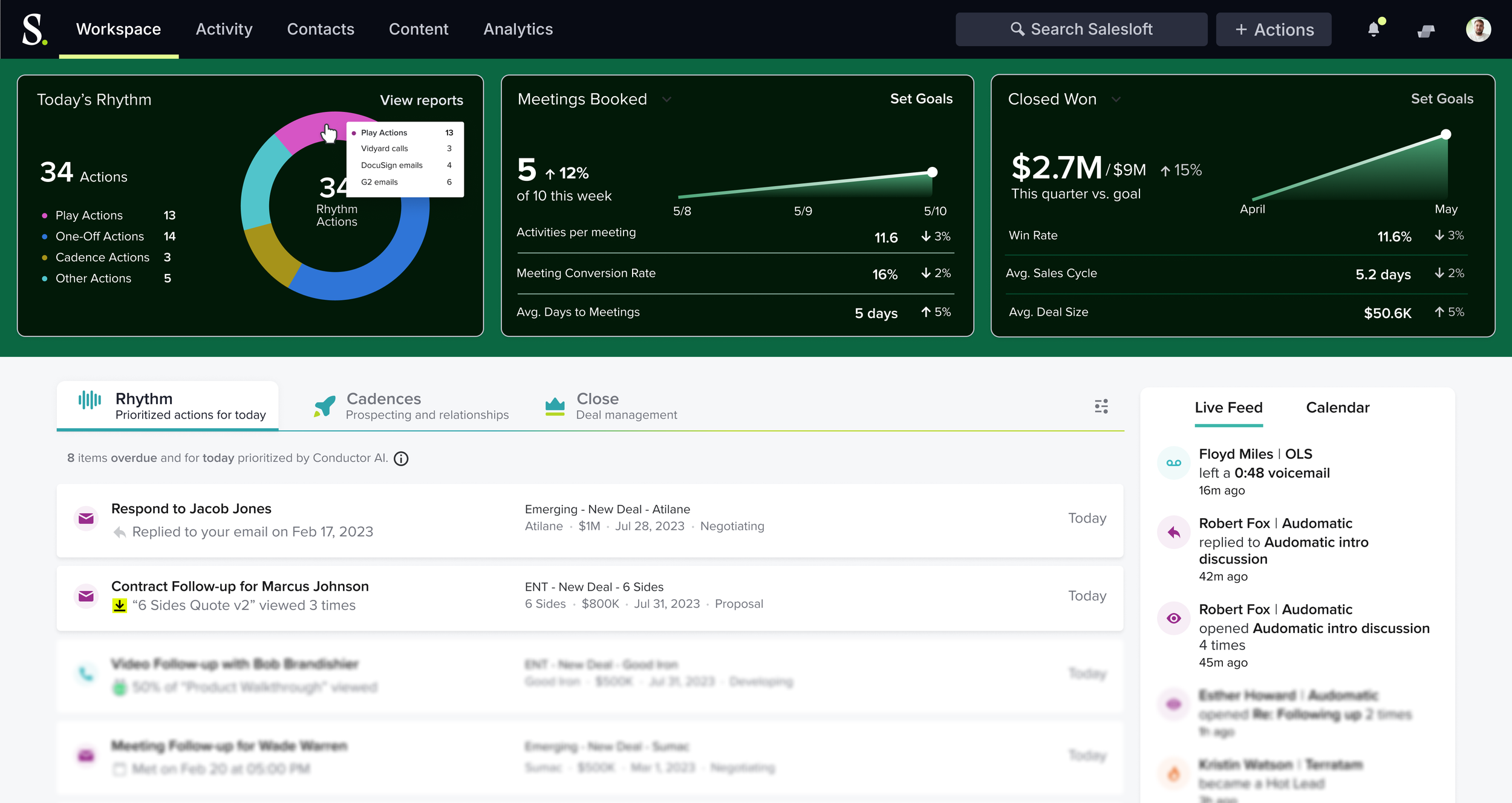
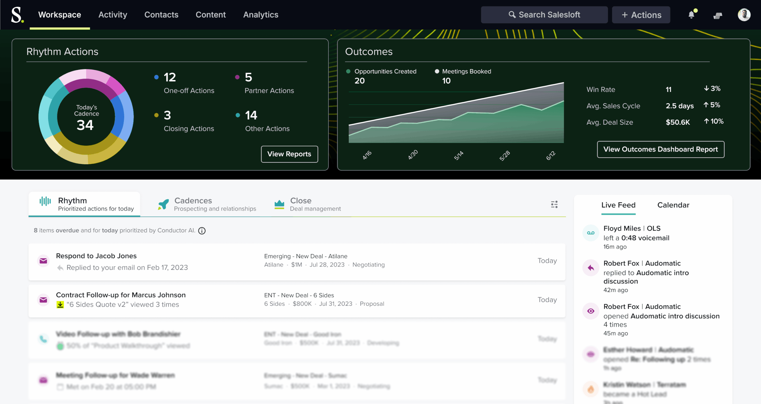
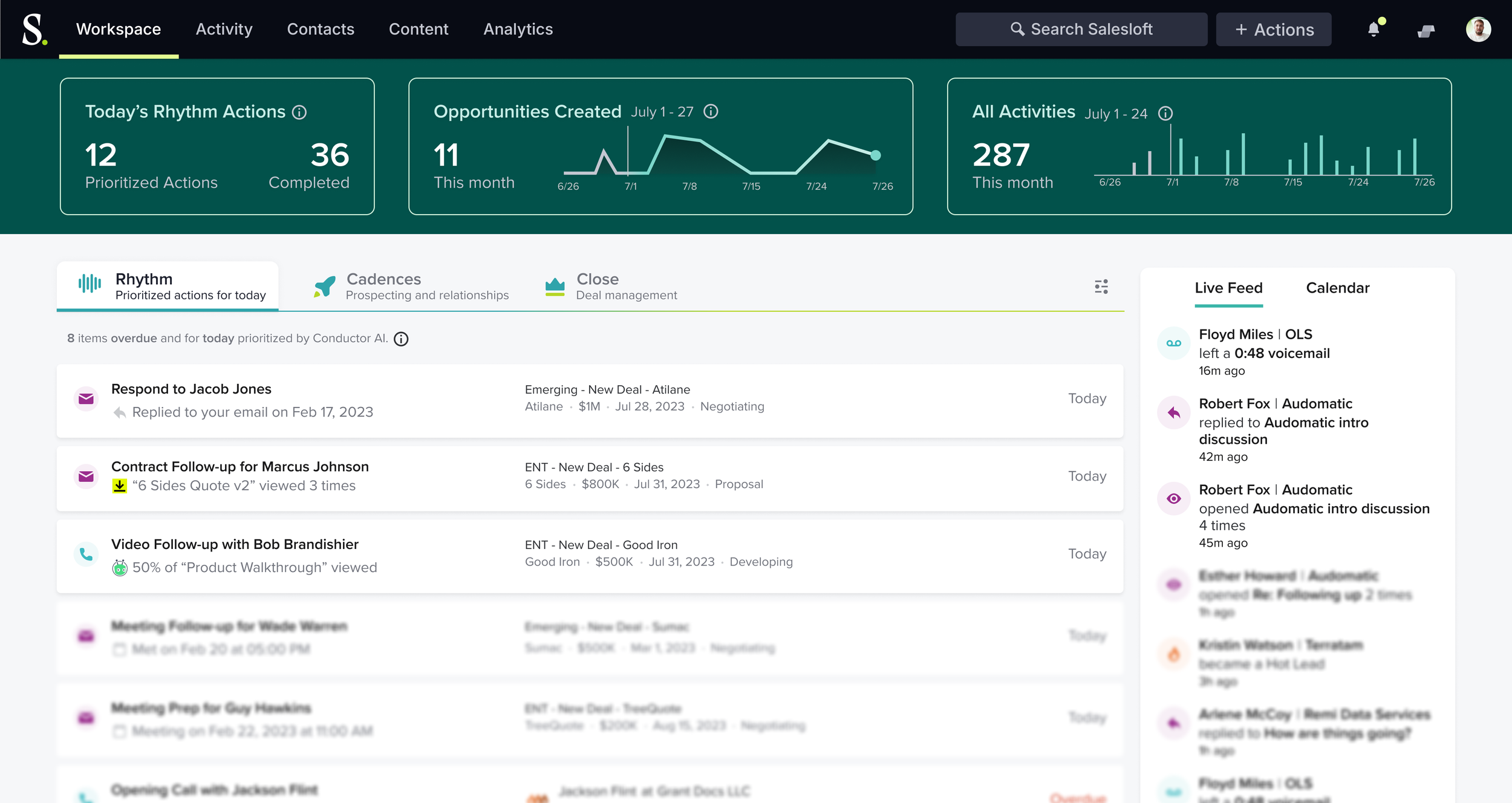
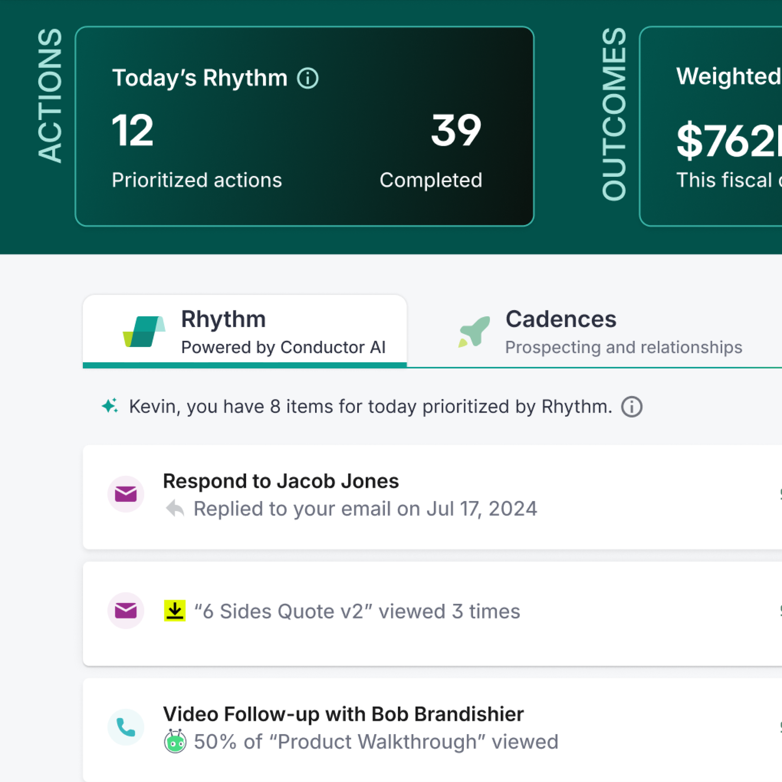
The design process began with research, moved through conceptual sketches, and culminated in a polished UX enhanced by compelling visuals. During beta testing, sellers emphasized the need for a space-efficient design that displayed tasks, customer information, and account details. Using just 320px—the width of the smallest seller monitor—I created a detailed, functional dashboard that addressed these needs effectively.
First iteration of the Rhythm dashboard with a treemap and bar charts
Exploring data visualizations with donut charts and helpful insights for sellers
Early concept work showing a collapsible header for sellers to maximize space within the Rhythm page
The Rhythm in-app page required a distinctive look and user experience to captivate customers and highlight the product’s ability to streamline sellers’ workflows. I led a design sprint to conceptualize a compact dashboard that guided sellers through daily priorities while providing performance insights and feedback.
The solution
Collaborating with staff designers, product experience leadership, and product managers, I refined the dashboard's visual design and page layout using insights from beta users. I enhanced the overall layout, improved typographic hierarchy, and introduced new colors. It was essential to reference the updated brand color palette while ensuring all selected colors adhered to WCAG accessibility standards.
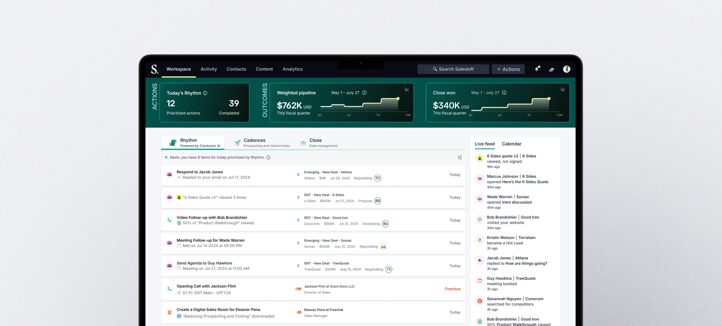
The first go-to-market Rhythm concept
Iconic impression: crafting Rhythm’s signature symbol
Designing a unique icon posed the challenge of balancing simplicity with complexity, particularly within the small 16 x 16 pixel size. My goal was to create an icon that conveyed movement, flow, and progress. To achieve this, I adhered to the constraints of the Salesloft design system, used brand colors, and ensured the icon met accessibility standards. The result was a distinctive and cohesive symbol that effectively communicated the intended emotion and energy.
The evolution of the Rhythm icon
The final Rhythm icon featured in the main Rhythm tab
Several early sketches of the possible icons for Rhythm
After several team reviews, our top picks were versioned in color and placed in tabs for context
I presented our top three icons to the Chief Product Officer, Executive Vice President of Product, Product Design Leadership, and Product Management. The requirement within the comparison chart help me to select the best icon for the platform.
A collection of Rhythm assets, that span marketing materials, internal t-shirt concepts, and in-app icon placement